
Guests skip waivers due to friction, not intent. Discover the top reasons waiver completion fails and how digital tools fix it fast.
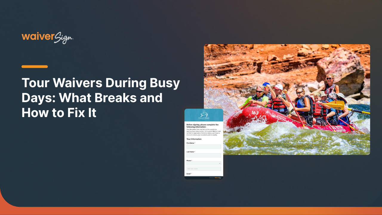
Busy tour days break paper waiver systems. Learn how digital waivers speed up check-in, reduce errors, and improve guest experience.
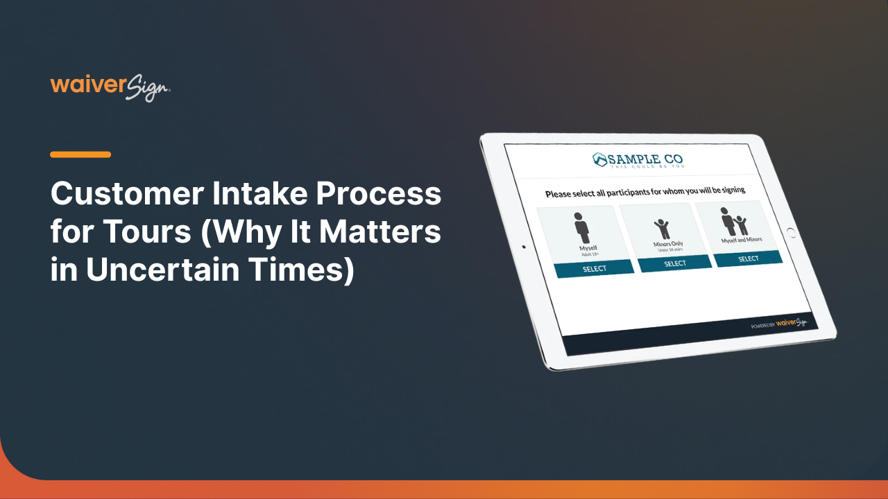
Learn how a clear customer intake process reduces risk, improves guest experience, and increases bookings for tour operators in uncertain travel conditions.

Discover how global uncertainty is reshaping traveler expectations—and how digital waivers help tour operators build trust, safety, and seamless experiences.
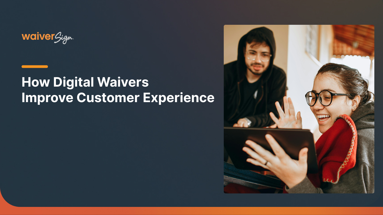
Digital waivers reduce paperwork stress, speed up onboarding, and improve the guest experience with mobile-first signing, multi-language support, and smoother check-in.

Discover how digital waivers streamline registrations, manage liability, and optimize bookings for tour operators and adventure activities this winter. Access templates and best practices.
Discover how Thanksgiving Point simplified guest check-in and reduced paper use with WaiverSign’s digital waivers—creating a faster, more efficient, and guest-friendly experience.
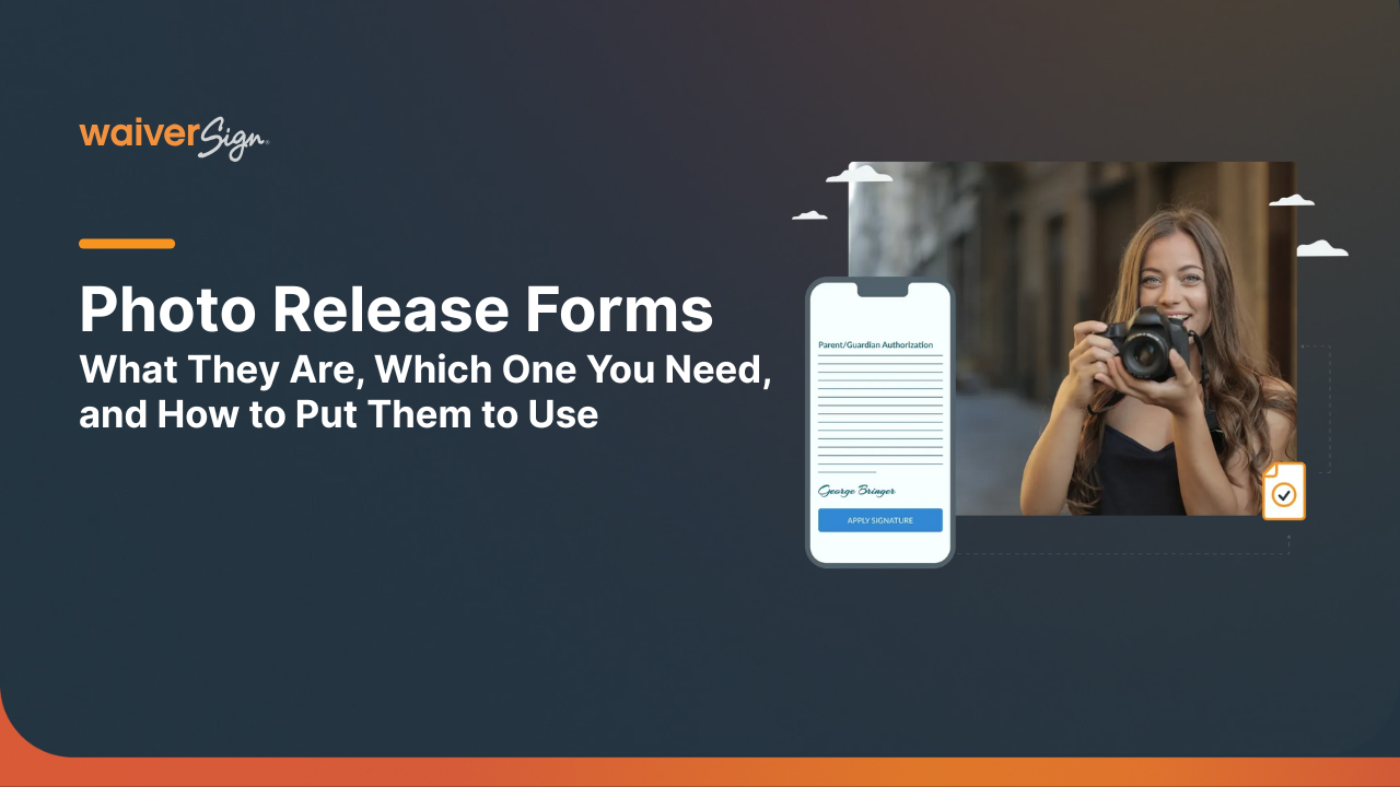
Photo release forms, like any legal document, can be pretty complicated. Here, we simplify it for you, and explain how you can do them even better.